Inquisit Ink Case Study
CHALLENGE
Rick had built a successful career as a children’s book author with several published works available in multiple languages. Ready to expand his reach beyond the Caribbean and transform his personal brand into a formal business entity, Rick sought to create a brand that would accommodate his growth into motivational speaking and coaching while maintaining his foundation as an author.
His existing brand and website presented significant limitations. The logo and colors resembled a political campaign rather than an accomplished author and public speaker. His website was slow, received minimal traffic, lacked regular updates, and failed to connect his audience to his mission of “inspiring imagination to identify potential.”
With opportunities opening up for book tours and speaking engagements, Rick needed a complete transformation—not just visual updates, but a strategic repositioning that would elevate his visibility, gain recognition, and grow his credibility as an international author. He needed a brand and digital presence that would serve as a platform for expansion into new business opportunities and sustainable growth.
Transformations
That Drive Growth
"Working with Knowtizmnt on the rebranding of Rick S S Grant to Inquisit Ink was nothing short of transformative. From the very first consultation, their team demonstrated a deep understanding of brand identity, creative storytelling, and strategic positioning. They didn’t just help us change a name—they helped us reimagine our purpose and digital presence. Knowtizmnt skillfully guided us through the rebranding and website process with clarity, creativity, and an impressive attention to detail. They took the time to understand our mission, values, and long-term vision, and translated that into a brand identity and website that reflects the curiosity, intellect, and creative depth that define Inquisit Ink. Their professionalism, responsiveness, and ability to blend strategy with creativity made this transition seamless and inspiring. We are beyond proud of our new brand and immensely grateful to Knowtizmnt for their invaluable role in helping us take this bold step forward. If you're looking for a branding & website partner who truly gets it, Knowtizmnt is the team to trust." - Rick G
Brand Discovery
Rick’s journey as an author revealed a fascinating pattern: his most powerful creative moments consistently occurred near water. His first children’s book ideas came to him during a boat ride. Another inspiration struck while washing dishes before a hurricane. While visiting the African American Museum, a fountain triggered his next book concept.
Through our discovery, we uncovered that this wasn’t just about where ideas originated—it was about Rick’s ability to immediately transform those fleeting moments of inspiration into tangible creations. While others on the boat were celebrating, Rick was writing. In the face of an impending hurricane, he captured a children’s story. This pattern revealed the core of his gift: the ability to move “from inspiration to ink” without hesitation.
This transformative journey—the process of capturing inspiration and translating it into concrete expression—emerged as the central insight of our brand discovery. We realized that Rick’s value wasn’t in being “just an author” but in his capacity to help others bridge the gap between abstract potential and tangible achievement, between imaginative ideas and meaningful action.
Defining the Brand
Working collaboratively with Rick, we explored his core values and aspirations. The brand strategy revealed that his true mission extended far beyond publishing books—he aimed to be a catalyst helping others transform their inspiration into tangible action.
This insight led to the identification of key brand attributes centered on being supportive, purposeful, and creative. These elements shaped how the brand should look, sound, and act—creating a personality that is confident and deliberate while maintaining a warm, inspirational tone that connects with diverse audiences.
Most importantly, we discovered that Rick wasn’t simply an author or publisher, but rather someone who bridges the gap between abstract inspiration and concrete creation. The ability to help others move “from inspiration to ink” emerged as the central brand promise, which would require a name and identity beyond the limiting scope of “Publishing.”
Customer Insights
We developed detailed customer profiles representing Rick’s primary audiences: aspiring seekers looking for inspiration and support providers who serve communities. These profiles illuminated their backgrounds, challenges, and needs, particularly their desire for resources that inspire authenticity and representation across cultures.
Competitive Analysis
Through market research, we evaluated other authors and publishers to understand the competitive landscape. Most competitors positioned themselves narrowly as either authors or publishers, with limited multicultural offerings. Their visual identities often relied on predictable imagery and conventional typography. This analysis revealed an opportunity to create a distinctive brand that could bridge cultures and creative disciplines.
Positioning
Understanding Rick’s vision to be a catalyst for others helped define the positioning strategy. We developed the big idea: “Inquisit Ink is the catalyst in moving from inspiration to ink,” differentiating him from competitors who focused primarily on finished products rather than the transformative journey. We established core values around being the nexus, addressing gaps, and daring to grow.
BRAND IDENTITY
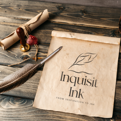
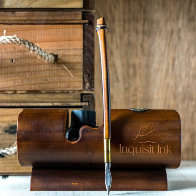
A New Logo
We created a logo system for Inquisit Ink that visually represents the brand’s story and personality. The mark features stylized elements that simultaneously evoke a quill pen, pathways, and the letters “I” for “Inquisit Ink.” The lines below the quill also suggest a book, connecting to Rick’s foundation as an author while allowing room for his expansion into speaking and coaching.
A Sophisticated Color Palette
The color palette combines rich, warm tones with softer accents, creating a balance of professionalism and creativity. The primary colors convey trustworthiness while remaining approachable and dynamic. The secondary colors add depth and nuance that ground the palette while maintaining accessibility across digital and print applications.
Thoughtful Typography
For Inquisit Ink, we selected a combination of Zen Old Mincho (serif font) and Noto Sans (sans serif font). The serif font brings a classic, literary quality appropriate for an author’s brand, while the sans serif companion creates a modern, approachable impression for broader applications. This typographic system allows for clear hierarchies in content while reinforcing the brand’s sophisticated yet accessible personality.
STRATEGIC NAMING PROCESS
Just as Rick’s creative inspirations come unexpectedly, so did the realization that his original name, “Rick Grant Publishing,” no longer fit his evolving vision. What seemed like a straightforward descriptor had become a constraint, limiting the perception of someone whose true gift is helping others transform moments of inspiration into meaningful action.
Building upon the central insight that Rick’s value lies in facilitating the “inspiration to ink” journey, this transformative process—moving from fleeting ideas to concrete expressions—became the strategic foundation for our naming approach. The name needed to embody both ends of this journey and the transformative space between them. Instead of focusing on Rick’s output (published books), we sought a name that could capture the full arc of transformation from initial spark to final creation.
“Inquisit Ink” emerged as a solution that elegantly frames this journey—”Inquisit” representing the curious, questioning beginning of creation, and “Ink” symbolizing the tangible manifestation of ideas. The name encapsulates the brand’s promise to guide others through their own transformative journeys from inspiration to expression. Its distinctive construction and memorable rhythm provide immediate brand recognition while remaining authentic to the strategic positioning.
WEBSITE DESIGN & DEVELOPMENT
A Digital Embodiment of Purpose
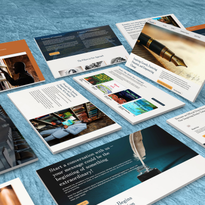
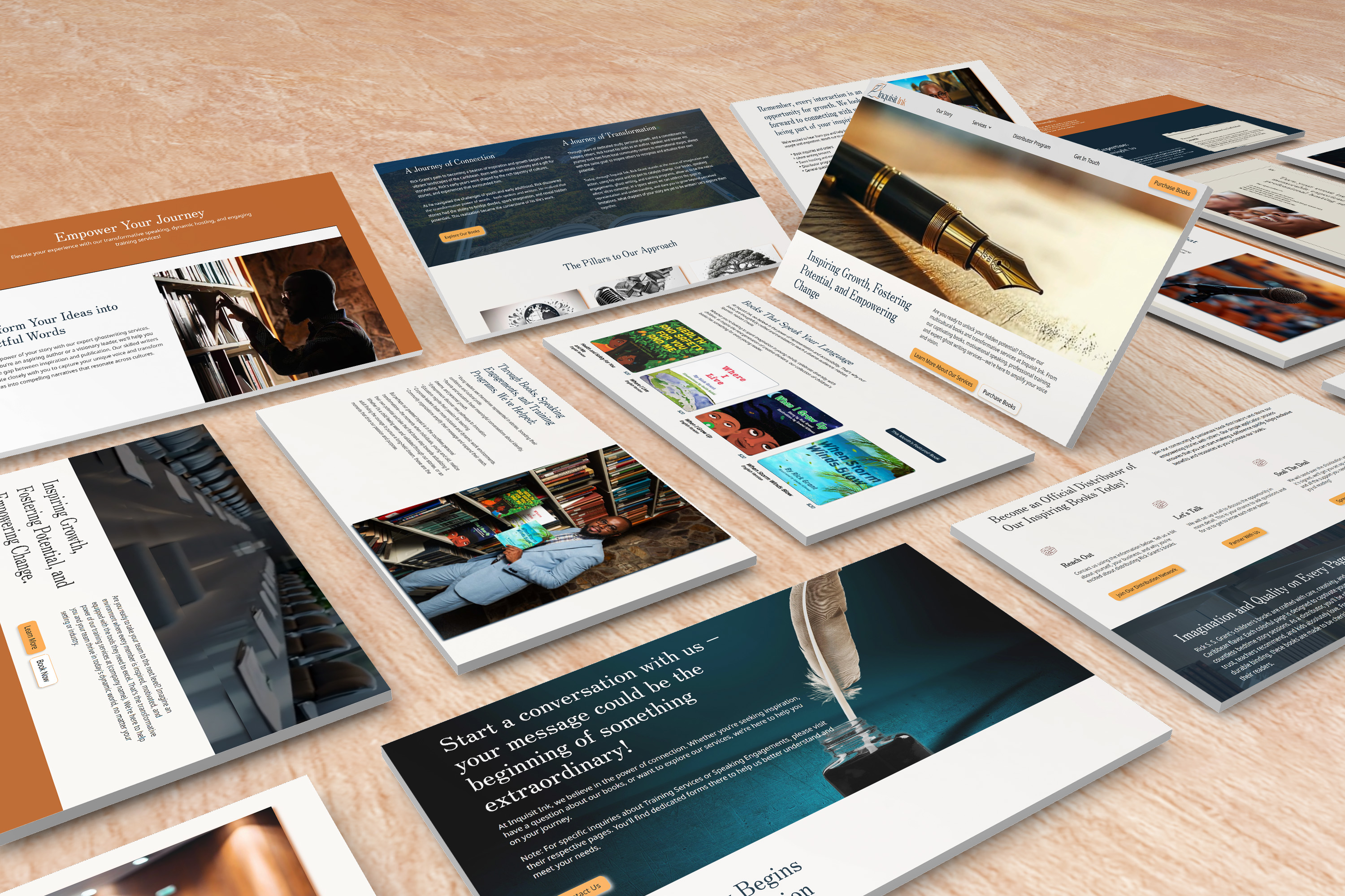
The Inquisit Ink website serves as the digital manifestation of Rick’s mission to inspire imagination and identify potential. The homepage immediately establishes this purpose with a bold declaration of the brand’s core message, complemented by Rick’s warm, approachable presence through thoughtfully placed imagery.
Taking cues from the brand strategy, we created distinct pathways that address both of Rick’s audience segments. For aspiring seekers, content focuses on transformation and personal development. For support providers like educators and community organizations, the site highlights Rick’s ability to inspire through speaking engagements and training programs.
The multilingual capabilities—featuring content in English, Spanish, and Haitian Creole—directly reflect Rick’s commitment to bridging cultural gaps and making inspiration accessible across language barriers. This is particularly evident in the book collection section, which showcases his works in multiple translations, each with vibrant cover designs that appeal to diverse audiences.
Beyond merely listing Rick’s credentials, the website tells the story of his journey through meaningful content blocks like “A Journey of Connection” and “A Journey of Transformation.” These narrative elements reinforce the brand’s promise of guiding others from inspiration to tangible results. Interactive features such as the distributor program and speaker booking forms create practical pathways for engagement, allowing visitors to move from inspiration to action within the site experience itself.
OUTCOME
With the new Inquisit Ink brand and supporting identity system, Rick is now positioned to achieve his goals of securing large-scale book deals and expanding his speaking engagements. The brand identity—from the thoughtfully crafted logo to the warm color palette—establishes a sophisticated yet approachable presence that extends beyond publishing to encompass Rick’s roles as speaker, coach, and catalyst for transformation.
The strategic shift from “Rick Grant Publishing” to “Inquisit Ink” has fundamentally reframed Rick’s offering from simply producing books to facilitating the transformative journey from inspiration to tangible results. This positioning creates multiple revenue pathways through book sales, speaking engagements, event hosting, training services, and the distributor program visible throughout the website.
With the launch of the brand, the multilingual website serves as both showcase and functional platform, enabling Rick to reach diverse audiences while providing practical tools for engagement. The website’s architecture, reflecting the brand strategy’s focus on aspiring seekers and support providers, creates intuitive pathways for visitors to connect with Rick’s offerings in ways that align with their specific needs.
By transforming from “just an author” to a multi-faceted brand built around the promise of guiding others from inspiration to ink, Rick now has a strategic foundation to expand his impact across borders, languages, and creative disciplines for years to come.